Every spring, the fashion conversation shifts — and this year the shift is toward a palette that feels simultaneously grounded and luminous. Spring 2025 is not about chasing newness for its own sake. It is about colour with conviction: tones that communicate warmth, intention, and a quiet kind of confidence. Here is what the season is offering, and how to wear each story well.

Quiet Luxury Neutrals
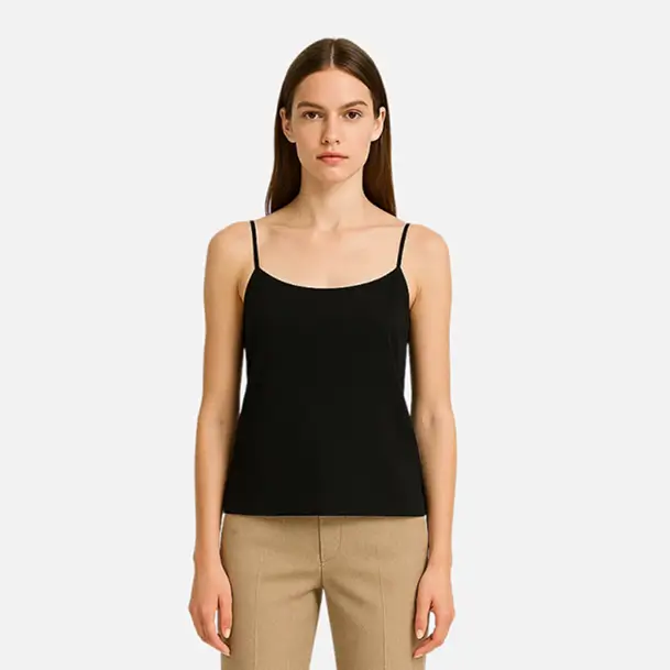
Cream, sand, warm ivory, and biscuit tones are not simply continuing their reign — they are deepening it. This season the neutral conversation becomes more specific and more considered. It is not just "beige"; it is the difference between a yellow-leaning cream and a grey-leaning one, between a matte linen and a lustrous satin in the same colour. Fashion houses are offering neutral collections where every piece is calibrated to work within a single warm or cool register, making total-look dressing in one tone feel intentional rather than accidental.
The key to wearing quiet luxury neutrals without looking washed out is contrast through texture. Pair a matte knit with a silk slip skirt in the same ivory. Layer structured tailoring over a fluid camisole. Let the fabric do the visual work while the colour remains serene and unified.
"Colour is a tool, not a statement. The most compelling spring wardrobes are built around tones that recede just enough to let the person wearing them come forward."
Dusty Blues and Sage Greens
The blues this season are not bright or saturated — they carry a deliberate faded quality, as though they have been washed many times and only improved. Cornflower, chambray, and slate blues feel effortless in shirting and wide-leg trousers. Sage, eucalyptus, and grey-green tones work equally well: they photograph beautifully in natural light and read as sophisticated in almost every setting, from the office to a weekend lunch.
Both families work particularly well when mixed together. A dusty blue linen trouser with a sage green shirt and tan mule creates a tonal palette that feels botanical and modern. Neither colour competes; both simply exist in a thoughtful, unhurried harmony.
Warm Terracotta and Clay
Earthy tones with a warm red undertone bring depth and richness to spring looks. Terracotta, fired clay, brick, and rust are more complex than traditional spring colours — they carry weight and warmth in equal measure, bridging the gap between the richness of winter and the brightness of full summer.
How to Wear Earth Tones in Spring
The secret is keeping the surrounding palette light. A terracotta linen dress worn with tan leather sandals and an ivory linen jacket is immediately spring-appropriate. A clay-coloured trouser with a white broderie blouse achieves the same result. The warmth of the earthy tone anchors the look; the lighter elements keep it seasonal. Avoid pairing earth tones with black in spring — instead, reach for dark chocolate brown or warm charcoal for a more sophisticated take on depth.
The unifying thread across all of Spring 2025's strongest colour stories is warmth — a move away from the cool, clinical tones of recent seasons toward something more human and more generous. Dress in colours that feel like the light you want to spend time in, and the season will take care of itself.